
Uniting diverse services under one entity.
The goal is to design a website and app for DXO that clearly showcases each of its subsidiaries as a recognizable team that clients feel confident to request service from.
Define a vision for DXO that aligns with all five subsidiaries.
Design a cohesive website that showcases DXO’s full range of services and a centralized request system while reinforcing trust, brand recognition, and organizational cohesion.
This project aimed to design a website and mobile app that reinforces Accenture Digital Experience Organization’s identity as a unified entity, rather than a collection of separate teams. The primary goals were to increase engagement and establish a cohesive brand for the organization. One design challenge was translating web designs into a mobile app.
Project Timeline 6 months
Role Lead Product Designer
Tools Figma
Findings
The Digital Experience Organization (DXO), a division within Accenture, is composed of five subsidiaries that lack consistent branding and a centralized platform for customers to request its services.
Hierarchy
Current Experience
The only way for clients to request support from DXO’s subsidiaries is by directly emailing its project lead. However, due to high request volumes, the response times are delayed or requests go unanswered.
This fragmented approach leads clients to abandon their requests altogether. The lack of a streamlined intake system not only impacts customer satisfaction but also limits DXO’s ability to scale and operate efficiently.
Research
The Digital Experience Organization (DXO) is composed of five teams: Change Management, Productions, Measurements, Accessibility, and Design Studio. While these teams function under a single organization, the branding and goals were not aligned, affecting project request conversions and limiting DXO’s ability to scale effectively.
Hierarchy
Our process began by conducting interviews with clients that have previously worked with at least one DXO subsidiary and analyzing client email requests to DXO project leads.
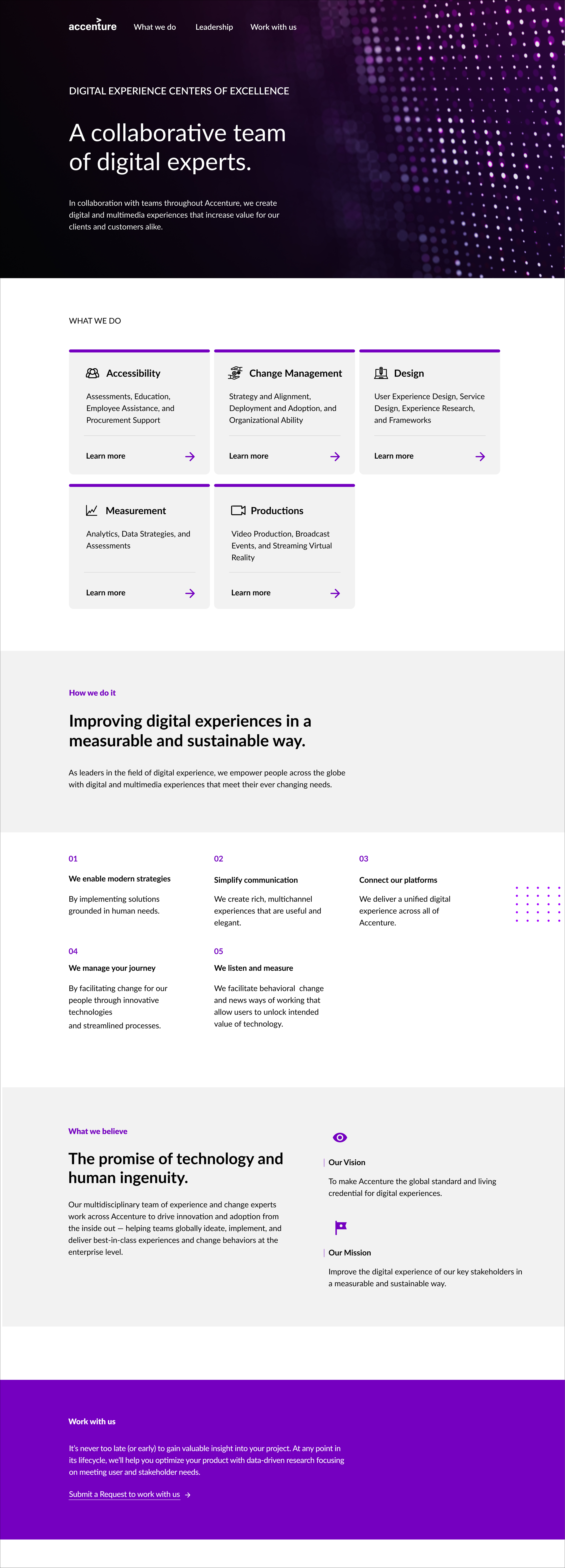
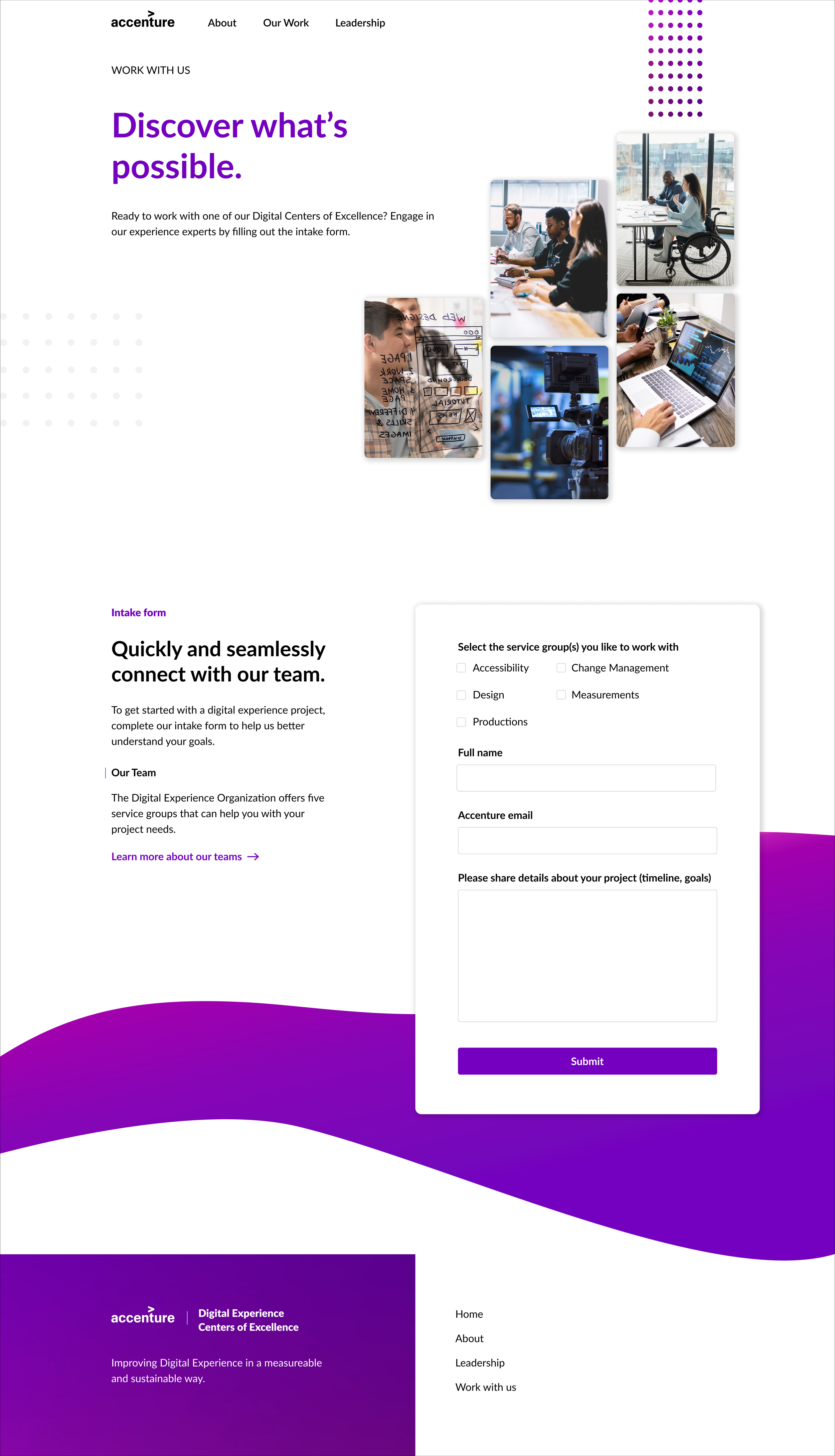
We set up the website and app to be structured around three main components: Introduce, Educate, and Request. The page introduces DXO with a headline that highlights its goal and purpose. The next section educates clients on each of DXO’s five specializations. Once clients have a clear understanding of DXO’s capabilities, they are guided to a centralized system where they can submit a request to engage with DXO services.
of clients dropped off during the project request process
38%
22%
are aware the team they worked with is part of DXO
MVP
Web Landing Page (MVP)
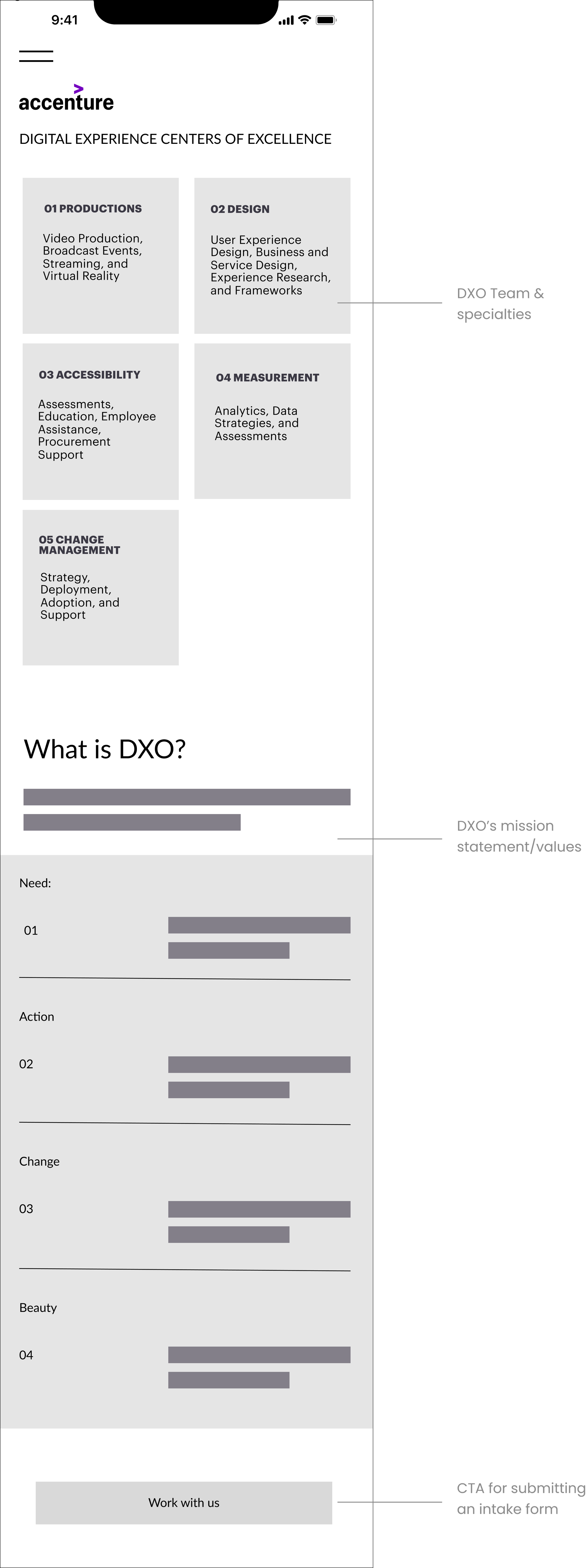
I began with an initial framework that placed the five DXO teams at the forefront of the screen, so users could immediately understand the structure of the organization. Under each team, their specialties and highlighted to give users a quick overview of their offerings.
To streamline engagement, a CTA that directs users to the intake form page is included.
Mobile Landing Page (MVP)
I identified the top tasks users come to this app for:
Learning speciality skills DXO can help them with
Submitting an intake form
With the limited amount of real estate I kept only the features and texts that support these high value actions. The lower priority information such as ‘Our Work‘ was moved to the menus.
User Testing
Iteration 1
Web Landing Page
After two studies we tested the user flow of getting more information about the DXO teams and whether users felt confident enough to request work from DXO. We learned users spent very little to no time on the DXO mission/goal section and instead were looking for more information about each team’s offerings.
Web Intake form
When instructed to fill out the intake form there were several users scrolling back and forth between the subheading and intake form.
Since the subheading provided important context, we needed both the instructions and the form fields to be fully visible on the screen. We concluded that the layout needed to be adjusted so users could see the guidance while completing the form, reducing confusion and improving task completion
Iteration 2
Web Landing Page
To reduce navigation friction and give immediately clarity about each team’s expertise, I presented detailed information about each DXO team at the forefront of the page.
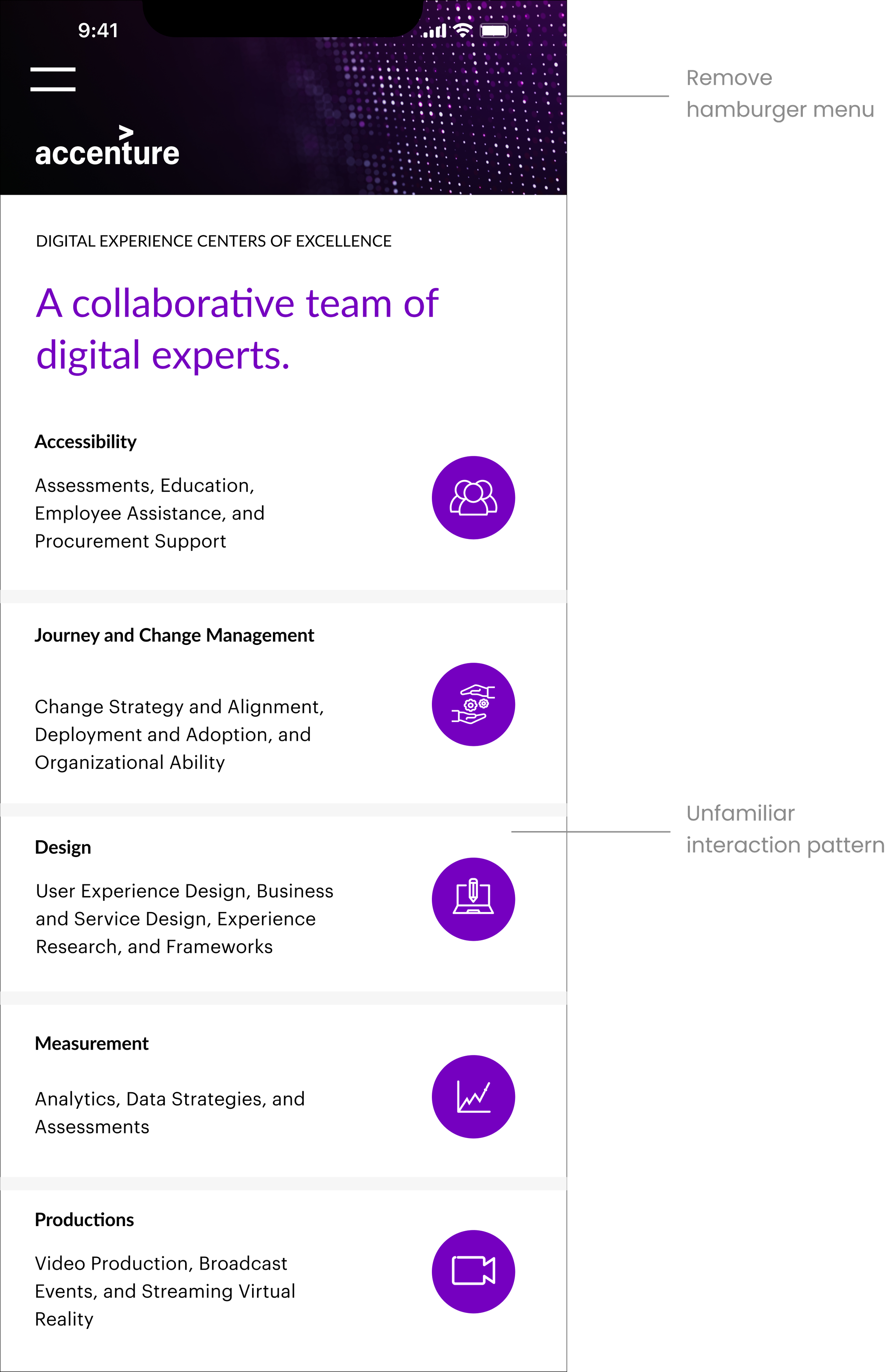
After several tests conducted for about two weeks, we observed that about 2/3 of users didn’t engage with the icons as they mistook them for static icons so we needed to find an alternative to get users to the ‘About us’ part of the app.
Final Design
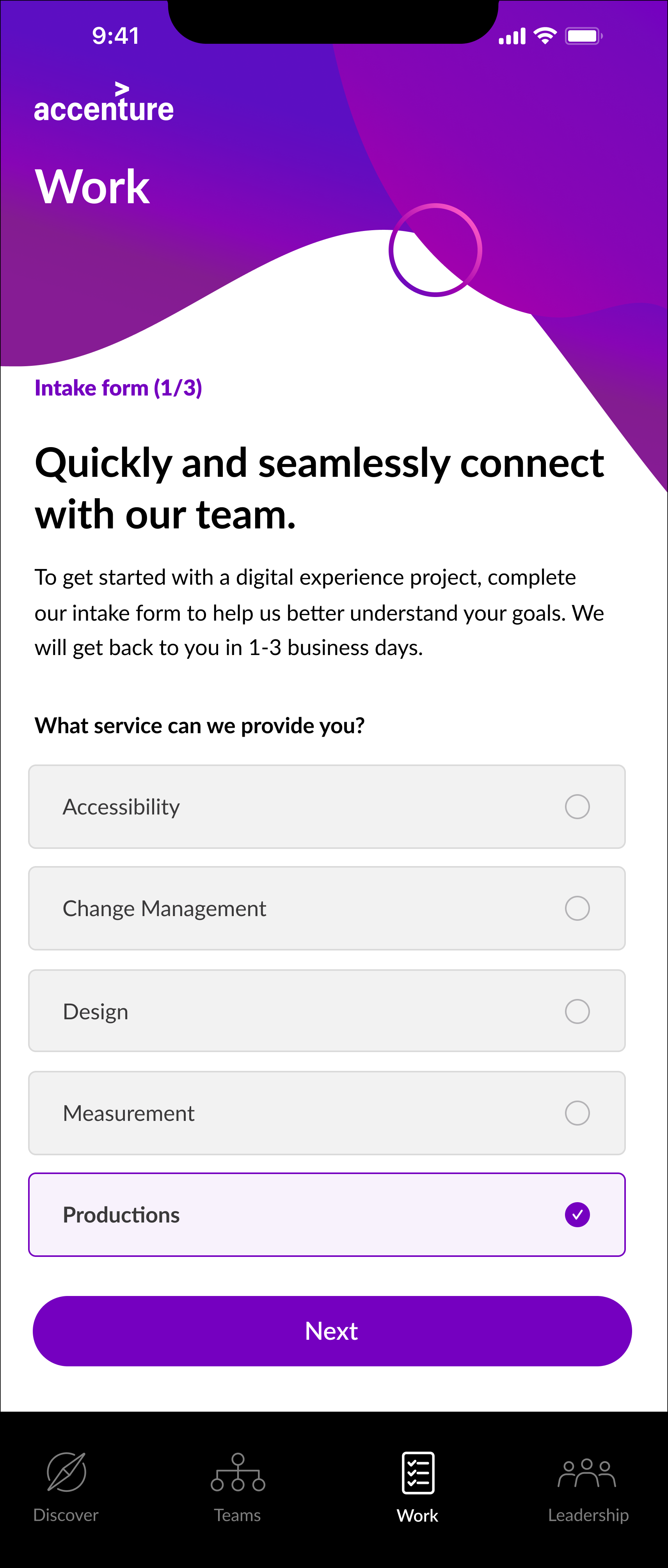
Intake Form:
Cards provide larger tap areas, reducing errors
The use of icons with card-style buttons makes each option more visually distinct, so users can scan and identify choices faster
Discover:
Given that users voiced their concerns over the large amount of information on the home screen, I decided to simplify the experience by prioritizing the most critical actions and applying progressive disclosure to reveal information gradually
‘Work with us‘ CTA:
The CTA is immediately presented to the user when they open the app to increase engagement
Under ‘Teams‘ there is also a sticky CTA that follows the user if they decide that they want to work with a DXO team after learning more about each team
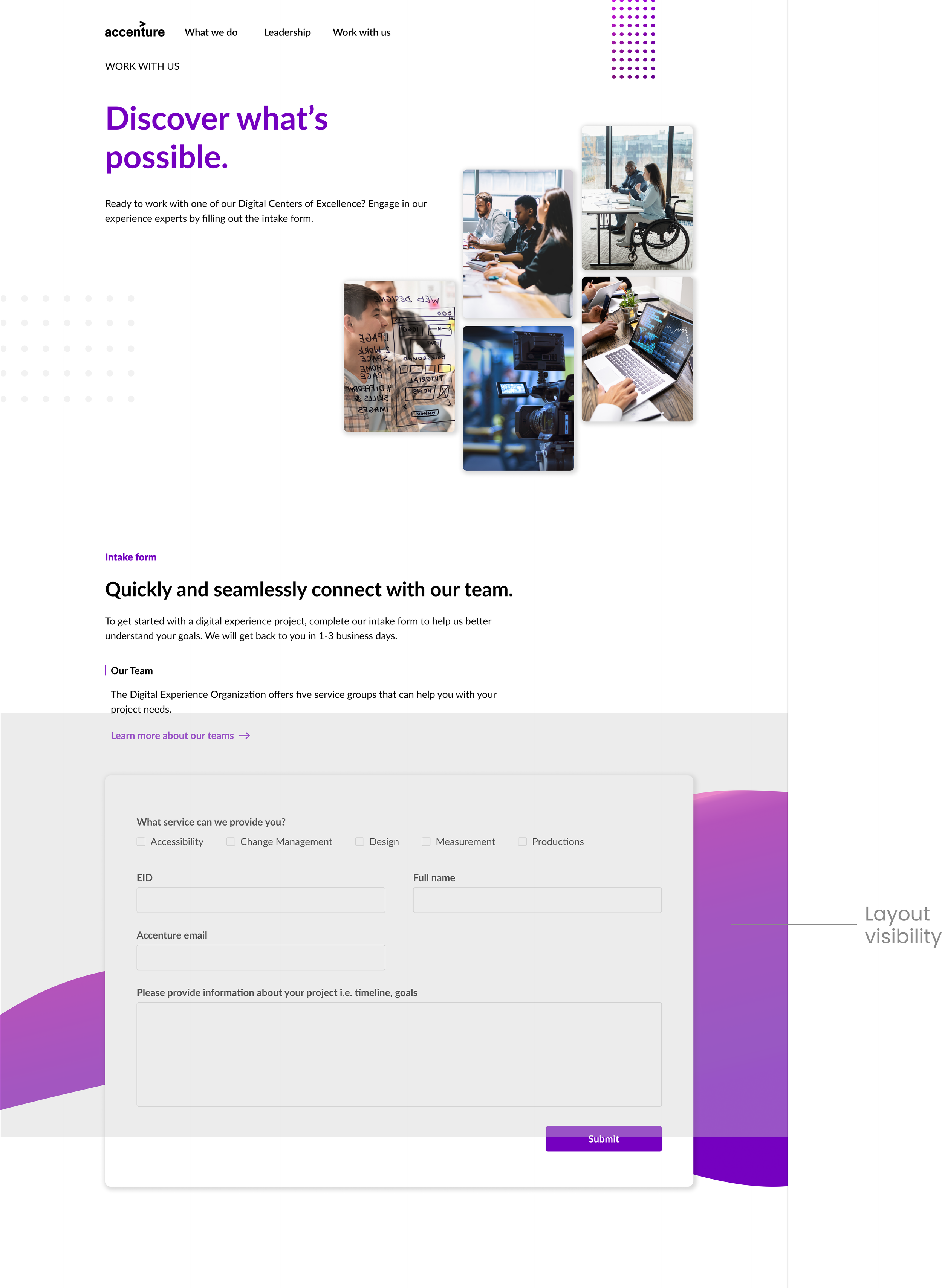
A centralized project intake form:
We wanted clients to have multiple entry ways to the intake form from the landing page and those entry points be the focus of the page.
Work with us
Mobile Landing Page
Prioritizing Information:
I decided to move DXO’s mission/values section under its own tab to prioritize DXO’s teams skillset to encourage users to engage with the intake form
About

Mobile Landing Page
Users voiced that the page was text-heavy, creating cognitive overload. Users struggled to scan and digest information quickly, which reduced overall engagement.
Similar to the website findings, we identified the ‘Work with us’ CTA had low engagement because it wasn’t visually prioritized on the main screen. We needed an alternative to keep it top of mind while still showcasing each team’s discipline.
Mobile Intake Form
We had found in our tests that there were many users who tapped on the wrong service given the smaller button surface.
About 1/3 of users voiced that the options felt overwhelming because the screen had a ‘busy‘ look to it, concluding that there is very little white space.
decrease in wait time for clients to hear back from project leads
-57.1%
The Impact
+37.4%
increase in project request by clients