
Enhancing support capabilities with data-led insight.
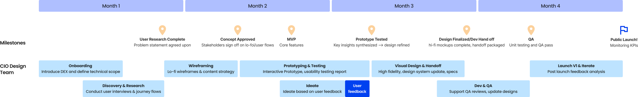
Project Timeline 4 months
Role Product Designer and Researcher
Tools Figma
We redesigned a platform that measures and tracks the performance of Accenture digital applications used by employees, identifying pain points and boosting engagement and productivity.
Roadmap
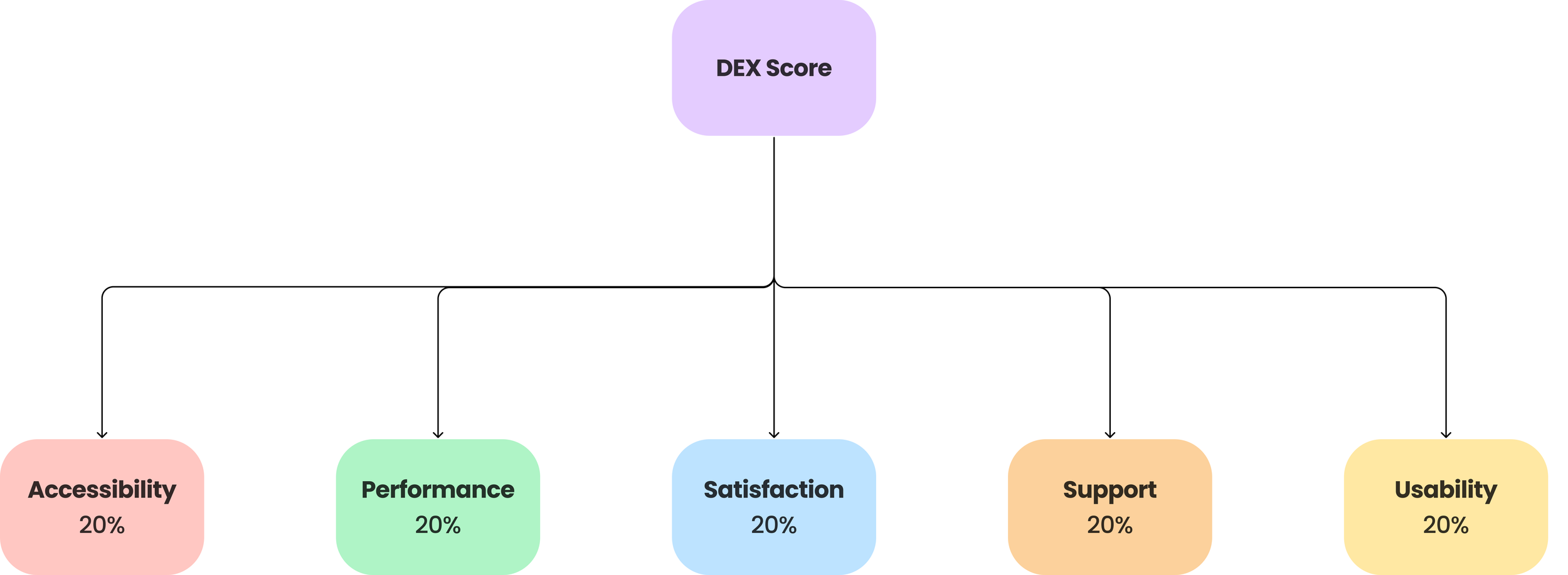
Product Experience Score
The DEX platform contains a Product Experience Score (DEX Score), which is a metric used to evaluate the quality of digital applications used by Accenture employees. It’s composed of five key subcategories. Each of these application are given a DEX score between 1-5. If an app scores below a 4, users can utilize the DEX platform to analyze and identify improvement opportunities and pain points causing a low score.
The goal of the DEX platform is to boost employee productivity, engagement, and overall workforce performance by ensuring that the digital tools employees rely on are optimized for ease of use, efficiency, and support.
Current Experience
The DEX score is currently showcased on an Experience Measurement Dashboard (DEX Dashboard) where the DEX team can monitor and evaluate the health of all tools and apps used by Accenture employees. The team is leveraging this platform to proactively identify opportunities to improve UX and eliminate bugs.
The DEX team can search for an internal tool or app to learn more about the health and overall performance of that app through this platform
Research
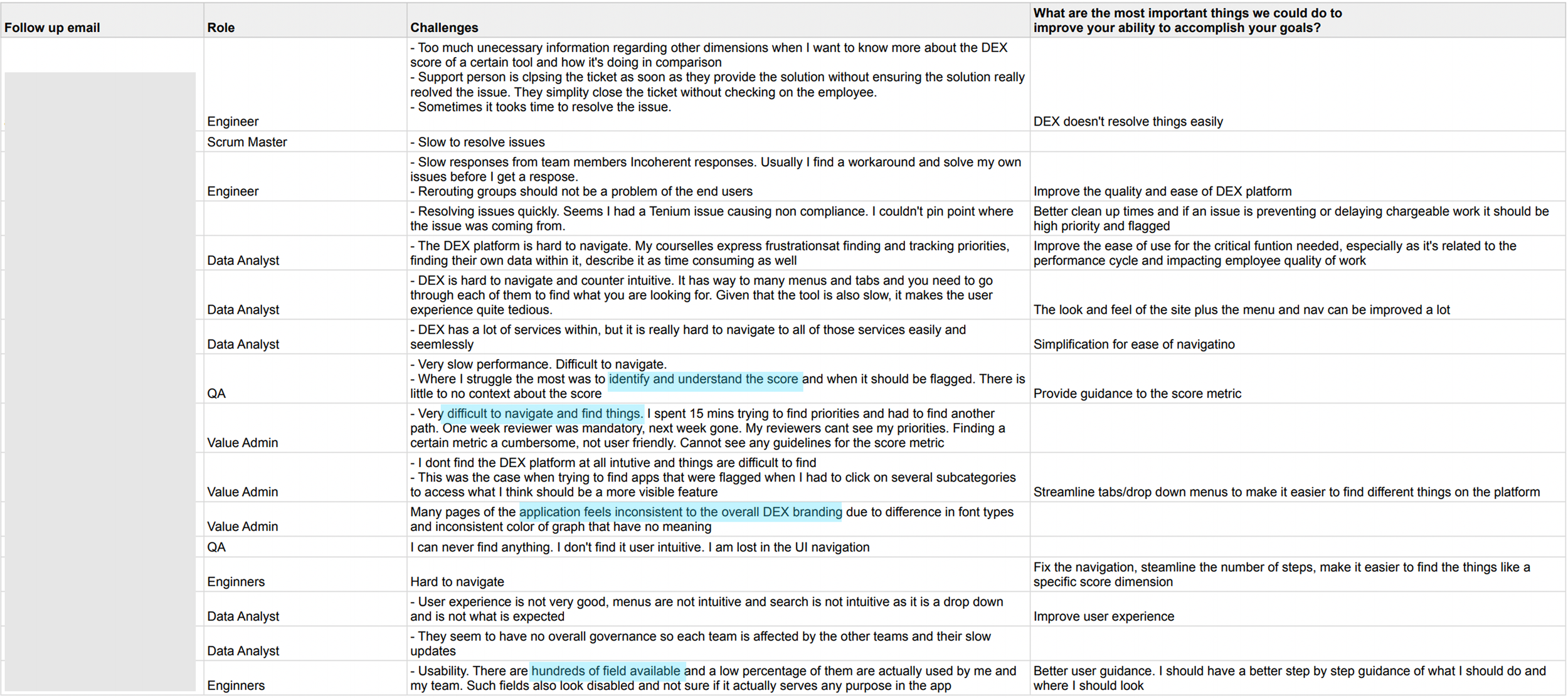
Our primary users are Accenture teams responsible for developing and maintaining internal employee applications. They rely on the DEX platform to monitor, measure, and improve the performance of the apps they support. Our team interviewed 30+ teams across Accenture who utilize the DEX platform (engineers, designers, data analysts, testers, and value admin).
We also asked users to walk through the platform when analyzing the health of an app. We learned:
Filters have a disabled feel and some don’t affect the platform
Searching for an app is not intuitive as it appears as a drop down menu
Difficult to locate the information that is needed because the navigation bar is overly clustered
The ‘Overall‘ page should provide more information about the overall Product Experience Score instead of detailed information of the dimension scores
Provides little information about the significance of the score and whether it is good/bad
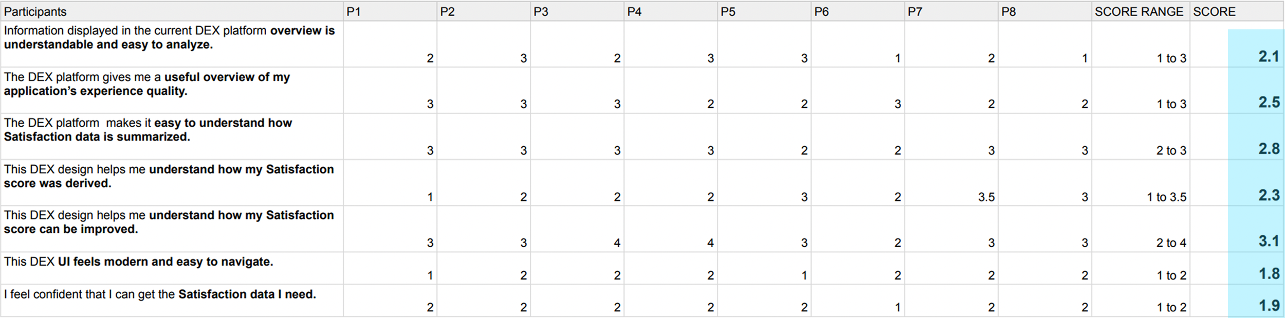
We asked participants within teams to rate each question regarding the ease of use of DEX between 1-5 (1: strongly disagree, 5: strongly agree).
Summarized Pain Points:
Overloaded and Hard to Navigate: too much information is presented at once, making it difficult for users to find what they need quickly.
Missing High-Level Insights: the dashboard lacks quick, at-a-glances summaries to give users an immediate understanding of overall app health.
No Guidance for Improvement: the platform doesn’t provide actionable steps on how to raise a low score or improve app performance.
Inconsistent Visual Design: colors and graphs feel random, with no clear story or consistent branding to help interpret the data.
4.
2.
3.
1.
“Due to the crowded information (in the DEX platform), our team can’t efficiently find the problem that’s causing myTE to underperform...causing lower productivity for Accenture employees who use myTE” - myTE data scientist
Goals
1.
2.
Provide actionable guidance: data should help drive action and give users recommendations on how to improve their DEX score and enhance app performance.
3.
Streamline information: deliver clear visualizations and actionable insights that enable users to quickly understand app performance and efficiently complete their tasks.
Enable Quick Insights: give users the option of immediate clarity into app health without digging into details.
4.
Create a consistent visual language: use cohesive branding, color systems, and data visualization patterns to enhance data
MVP
Product Experience Summary Section:
I started out with this initial framework where users have quick insight of the DEX score and how its been doing overtime.
Users can also see more details of the 5 dimensions that make up the DEX score and how it may be affecting the score.

Iteration 1
Product Experience Summary Section:
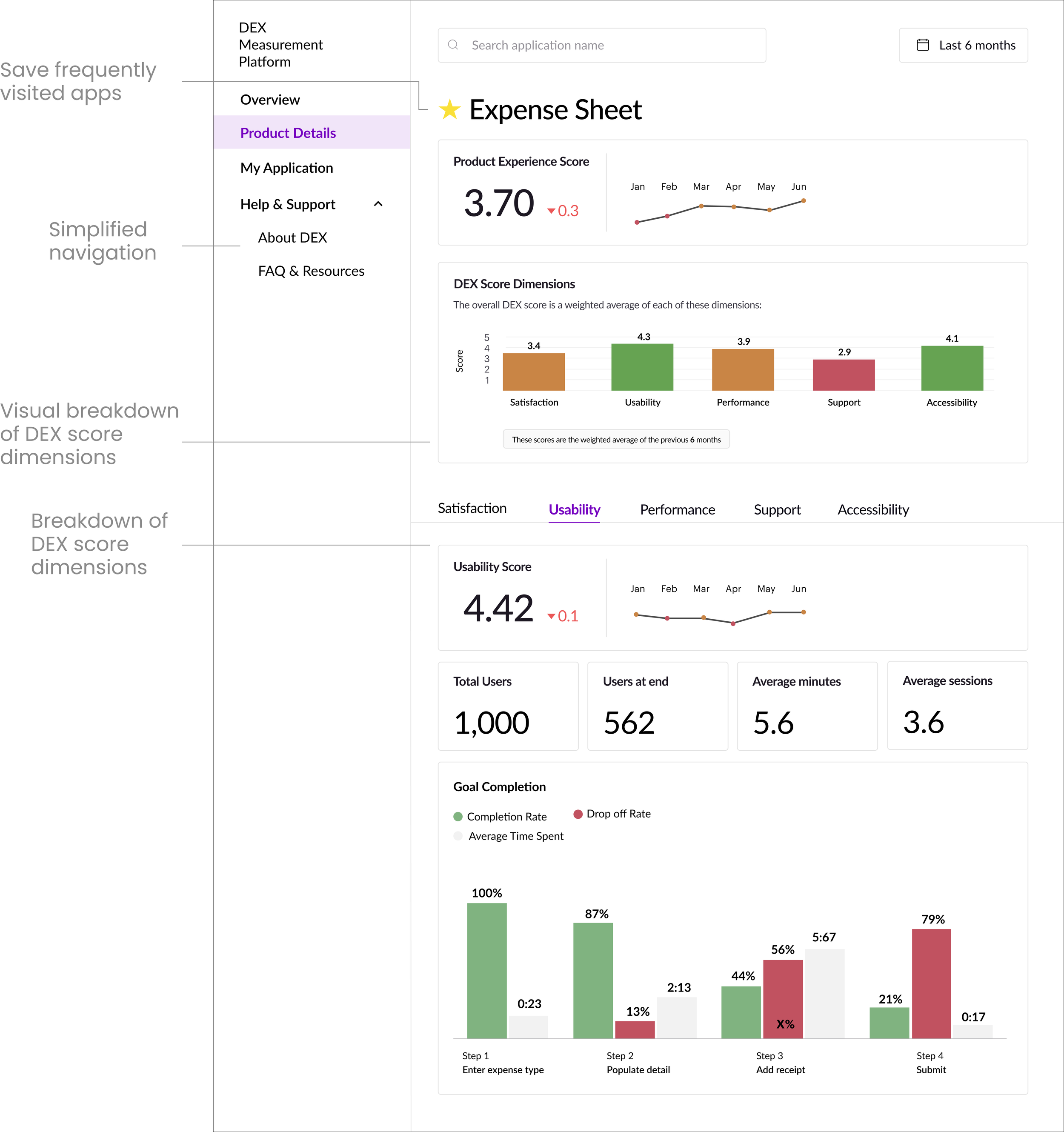
For this initial iteration, my primary goal was to make the DEX score and its dimensions more visible and easy to understand. I placed the overall score at the forefront of the page in a digestible format, removing unnecessary graphs and jargon-heavy text that distracted from the core information.
To give users deeper insight, I introduced an expandable view for each DEX dimension. By clicking on a dimension within the score summary, users can now access more detailed breakdowns without feeling overwhelmed upfront.
We also simplified the navigation through our research assessments and prioritizing frequently used tabs and removing those that offered little value in tracking or improving DEX scores.
To enhance personalization, we introduced a “My Applications” tab, enabling users to favorite and quickly access the apps they monitor most often. This addition helps users tailor the platform to their workflow and reduces time spent searching across the system.
We asked the users to search and find an application that they want to analyze in the iteration 1 DEX design. We found that:
Users felt that there was a disconnect between the DEX score dimensions and how it affects the overall DEX score
When asked to ‘favorite‘ an app users spent time looking for the favorite button, confusing the star icon with an app that DEX labeled as important
Users struggled to interpret what the DEX score and sub scores represented
Users found the line graph showing the DEX trend too generic and hard to interpret
There was a lack of actionable steps and users felt frustrated that the platform highlighted problems without offering guidance on how to fix them
User Test 1
Iteration 2
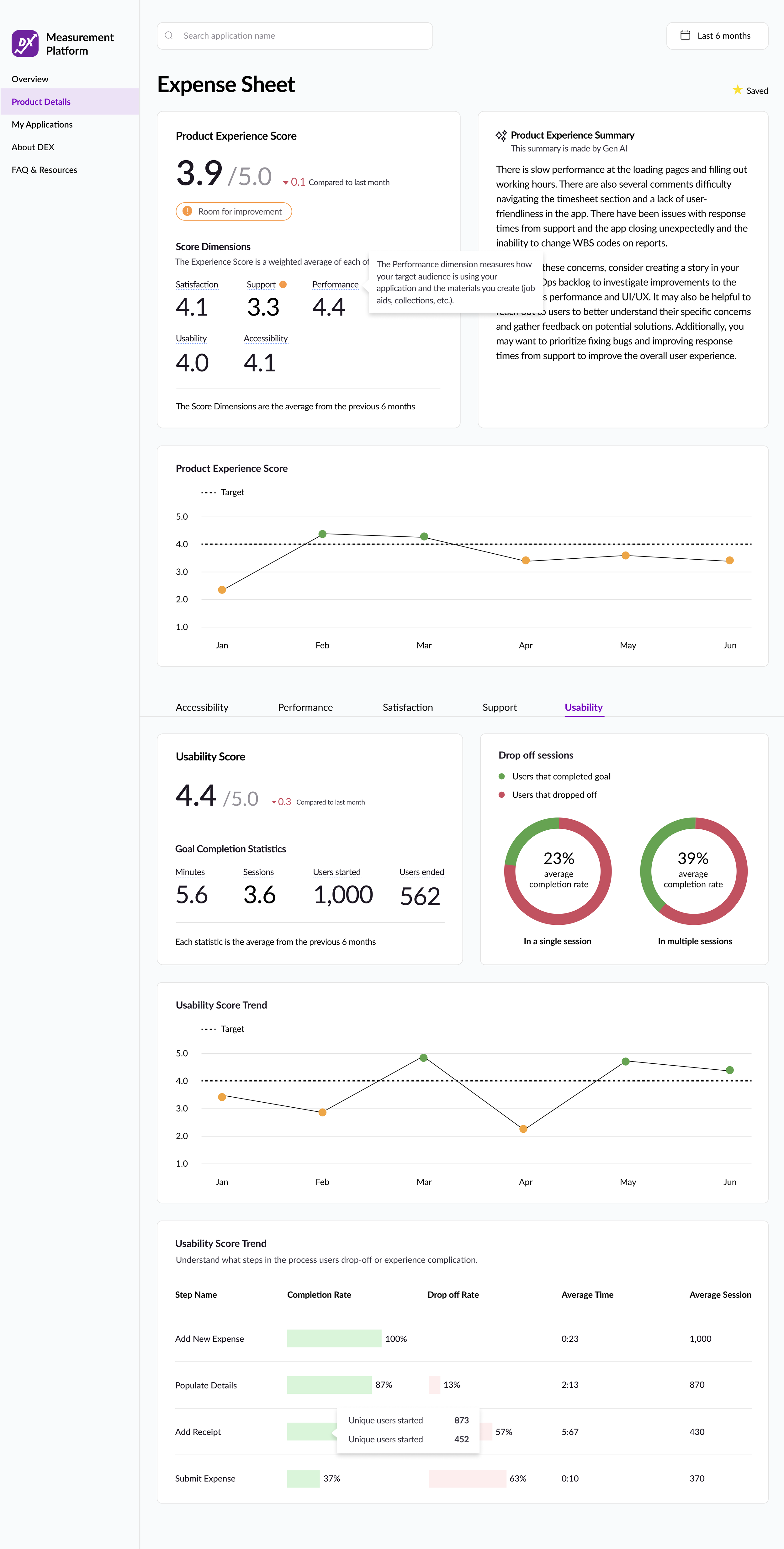
Product Experience Score Section:
In this iteration, I introduced a Product Experience Summary section designed to give users actionable insights into how their application’s DEX score could be improved. Leveraging GenAI, this feature provides tailored recommendations, helping teams move beyond identifying issues to actually addressing them.
I also redesigned the score presentation by combining the overall Product Experience Score with the dimensions that contribute to it into a single container. This makes the relationship between the overall score and its dimensions more intuitive, reinforcing that the sub-scores are key drivers of the overall score.
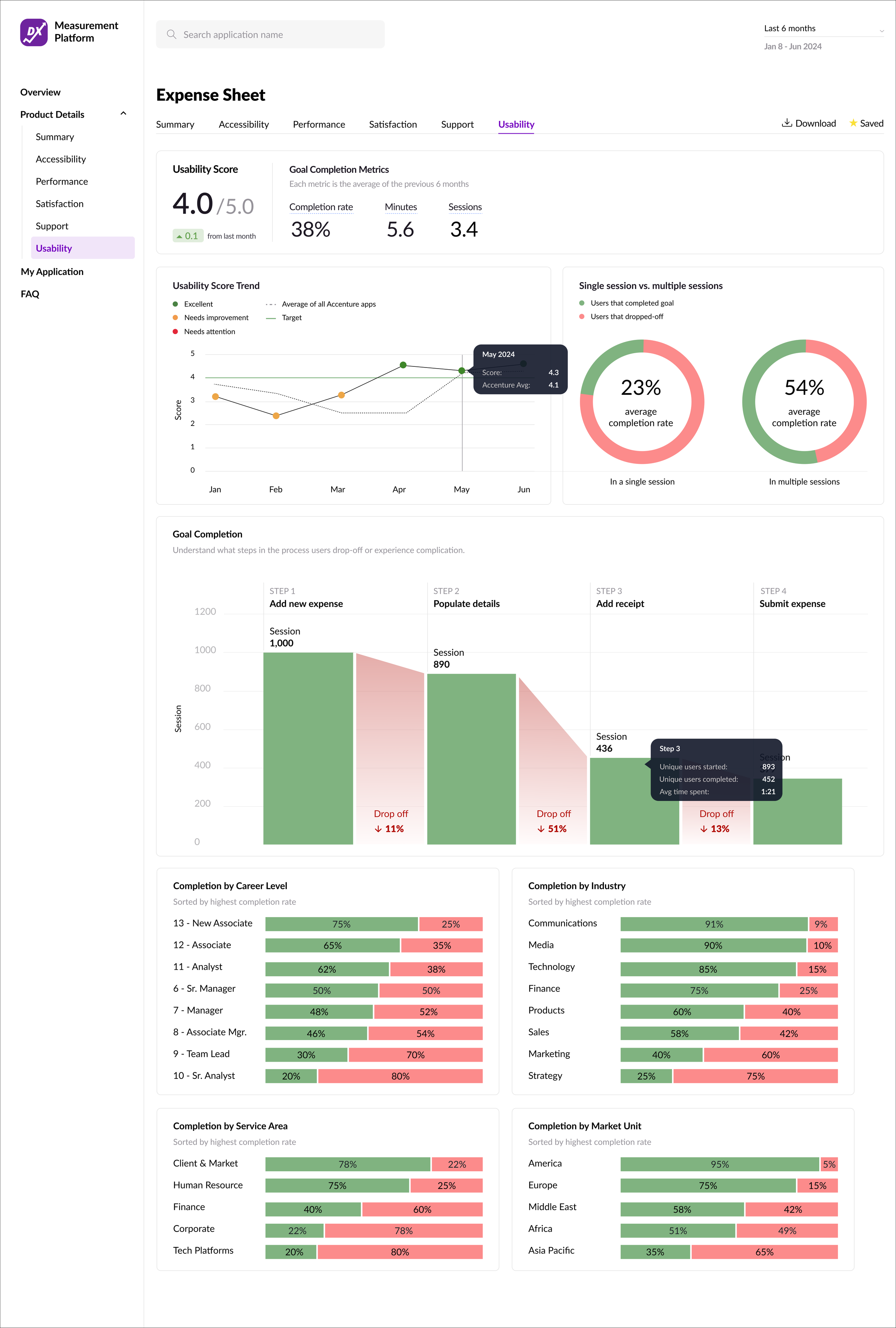
Usability Score Page:
I decided to put the ‘Average Time‘ and ‘Average Session‘ at the table instead of putting it inside the tooltip to reduce the number of steps users having to take to find these key informations.
User Test 2
Users prioritized the drop-off rate over the completion rate, as it more clearly identified the steps with the most friction.
Many users skimmed or skipped the Product Experience Summary, describing it as too information-heavy and rather have only the most important, key information about how to interpret and act on the DEX score.
About 1/3 of users struggled to interpret the ‘Room for Improvement‘ banner meant to bring attention to its low score. They weren’t clear on what it was meant to convey, creating uncertainty in understanding the data
When asked to explore the detailed views of each score dimension, users spent extra time locating the dimension navigation bar. This slowed down their workflow and suggested the navigation pattern wasn’t prominent enough
Final Design
Summary page
To address user feedback around information overload, I moved the Product Experience Score into its own dedicated “Summary” page. This page focuses on high-level product performance, allowing users to quickly understand the overall health of their application without being overwhelmed by too much detail at once.
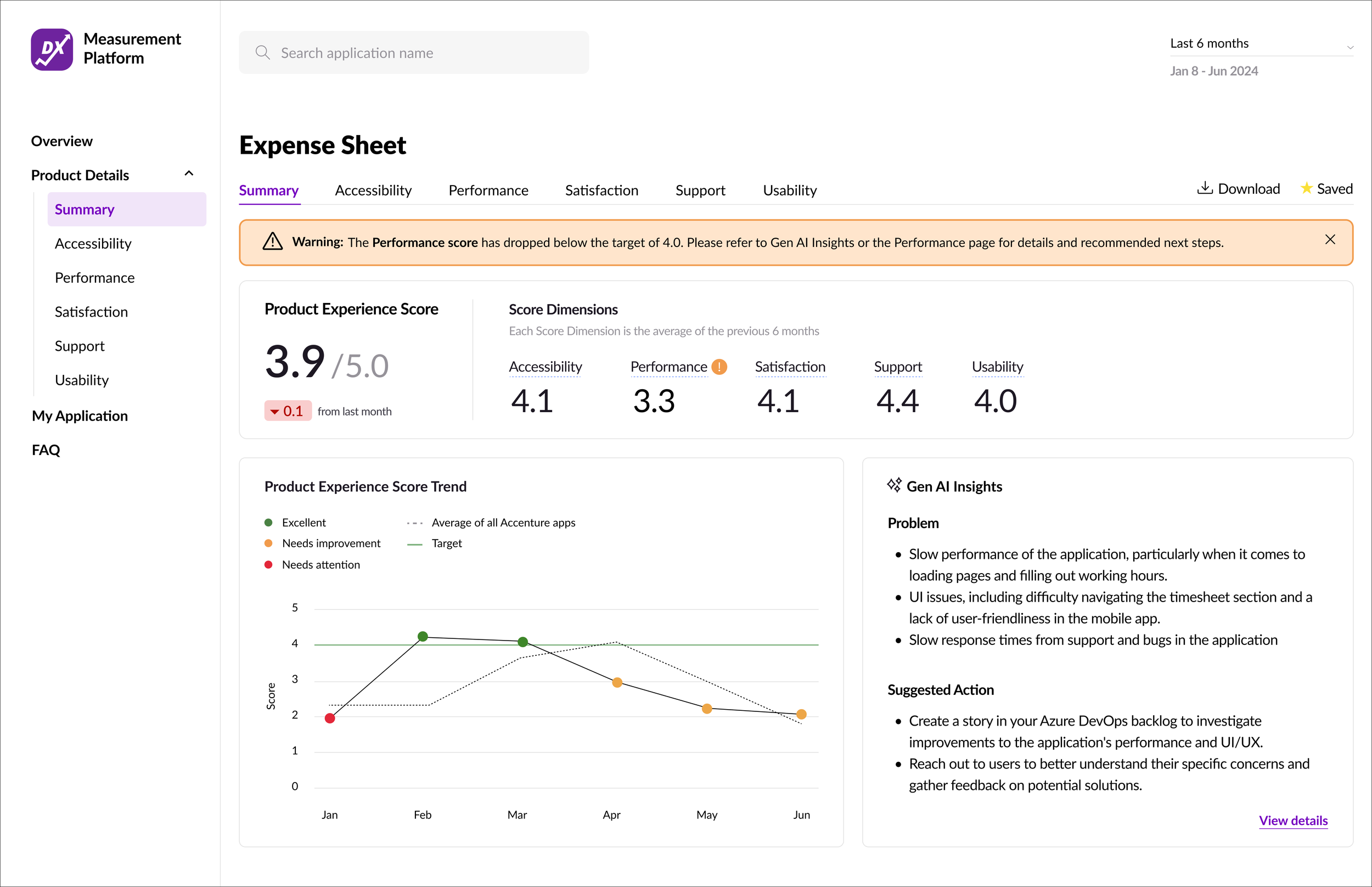
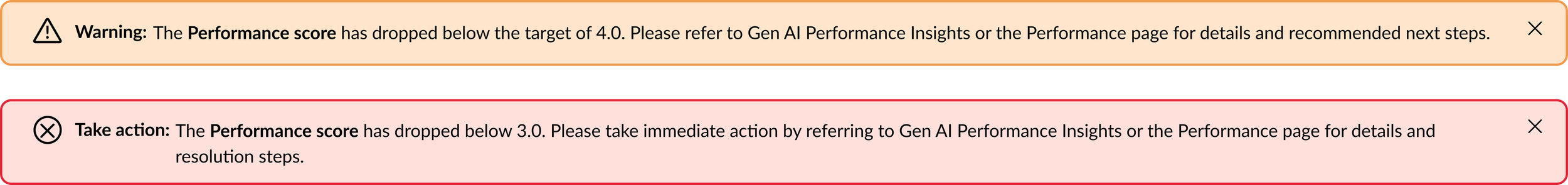
Warning banner
Introduced a warning banner at the top of the DEX Summary page to immediately alert users when a score falls below 4.0, prompting timely action.
Usability Score page
Instead of a repetitive table showing both completion and drop-off rates, I introduced a bar graph of session counts across each step. This visualization makes it easier to identify where drop-offs occur and highlights the specific steps with the most friction, giving users a clearer path to improvement.
Finally, because understanding drop-off and completion rates across different employee groups (career levels, industries, and market units) was a key user need, I surfaced this data directly within the Usability Score page. By eliminating the need to click through to a separate page, users can now access these critical insights more easily and are less likely to miss them.
Goal Completion Data Visualization:
Important factors that I considered when designing the data visualization for the goal completion data were clearly showing the the conversion path and drop-off rate within the funnel itself and at which step there is the most amount of friction, causing users to drop off.
Although I explored multiple iterations of this data visualization, my final two options were Graph A and Graph B. To validate which was more effective, I asked users to interpret both versions while navigating the Usability page.
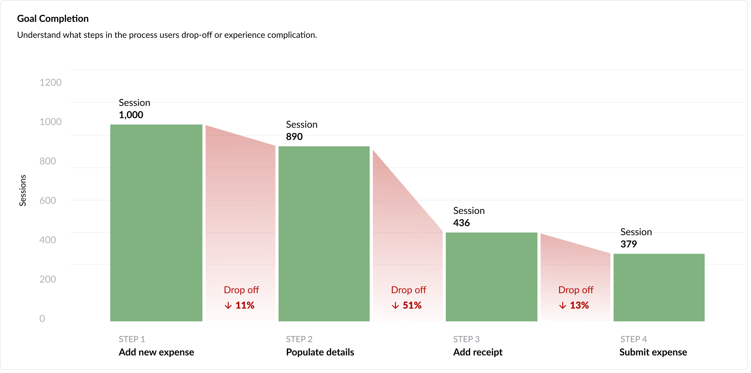
Graph A
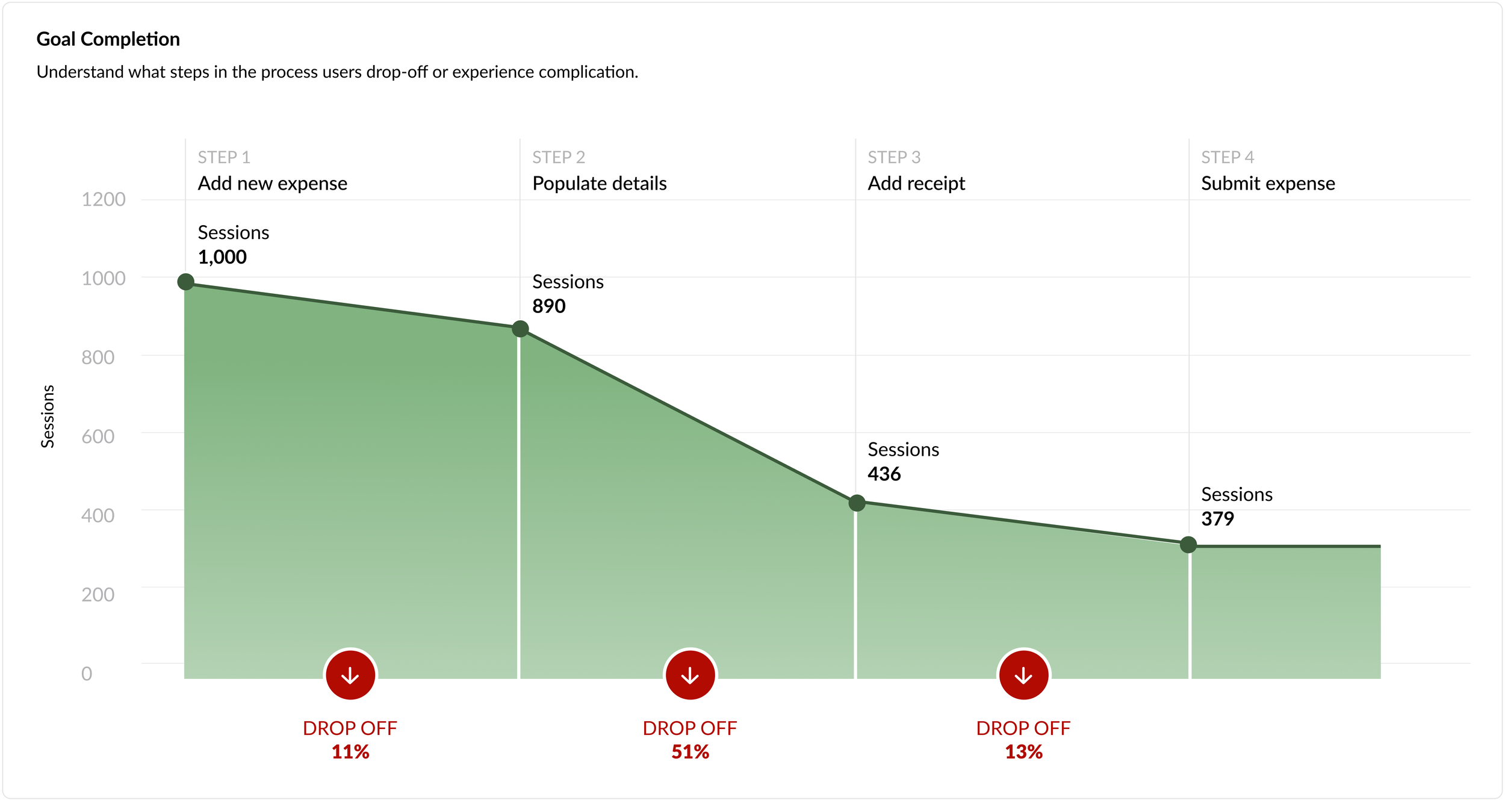
Graph B
Key Findings:
In Graph A, had an easier time identifying what each bar represented because the ‘Steps‘ label was easy to locate. Whereas for graph B the ‘Steps‘ label was not accurate, causing confusion about how the steps correlated with drop-offs.
In Graph B, users were able to quickly and accurately interpret the drop-off rate between each step. They felt that this version told the story of user friction more clearly and provided a stronger visual representation of where issues occurred.
Given these feedback, I decided to combine the two graph. I utilized the data visualization of Graph A but utilized the label styling of Graph B.
The Impact
24,000+
monthly visits
-40%
in troubleshooting duration
-23%
in compliance issues