
Connecting outdoor enthusiasts to the natural world.
This mobile app allows users to conveniently track and document wildlife. One main goal was to design an app that allows data collection and viewing to be performed without internet connection and sync it to a centralized database.
Project Timeline 12 weeks
Role UI/UX Designer, Front-end Developer
Tools Sketch
User Research
For our mobile app we identified one main user group, hobbyists, who are non-professional wildlife enthusiasts. We interviewed this user group to gain insight about motivations and challenges they face when tracking and finding information about encountered wildlife
Key Insights
Difficulty keeping track of encountered wildlife notes and photos due to lack of centralized record keeping system
Don’t feel confident exploring wildlife due to the difficulty of finding a community with common interest
Lack of quick expertise to help them identify the wildlife they find
“Because I am still a novice, I often can’t correctly decipher certain wildlife, so I want a community where I can casually document photos and gain insight from other enthusiasts“ -Hobbyist
Competitive Analysis
We discovered that our competitor apps focus on features that can only be used with internet connection. Our team walked through the processes of searching and documenting encounters through competitor apps uncovering four main pain points.
Key Insights
Unable to search and post encounters in offline mode
Users are forced to know exactly what projects they are searching due to lack of browsing capabilities
Inconsistent design for each page, making it difficult for users to navigate
Unable to execute multiple filters at once
Problem Framing
Hobbyists want quick, group insight in outdoor situations without having to depend on the internet or pen and paper.
Early Exploration
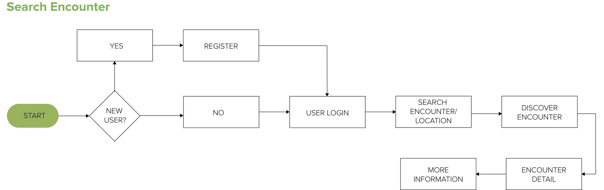
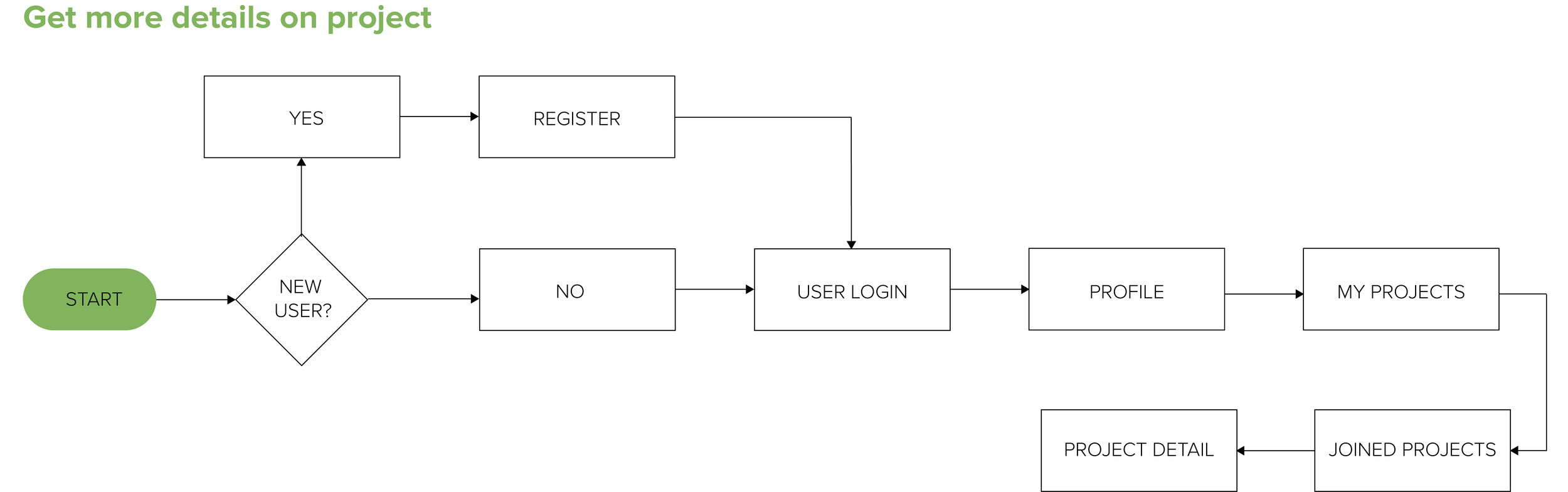
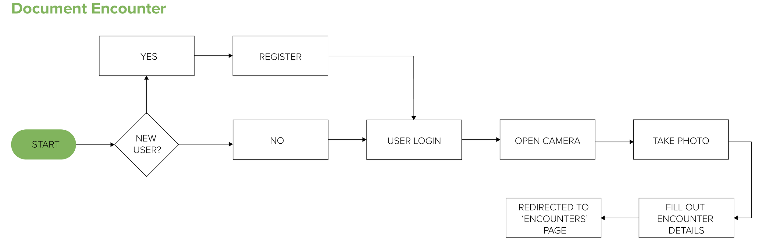
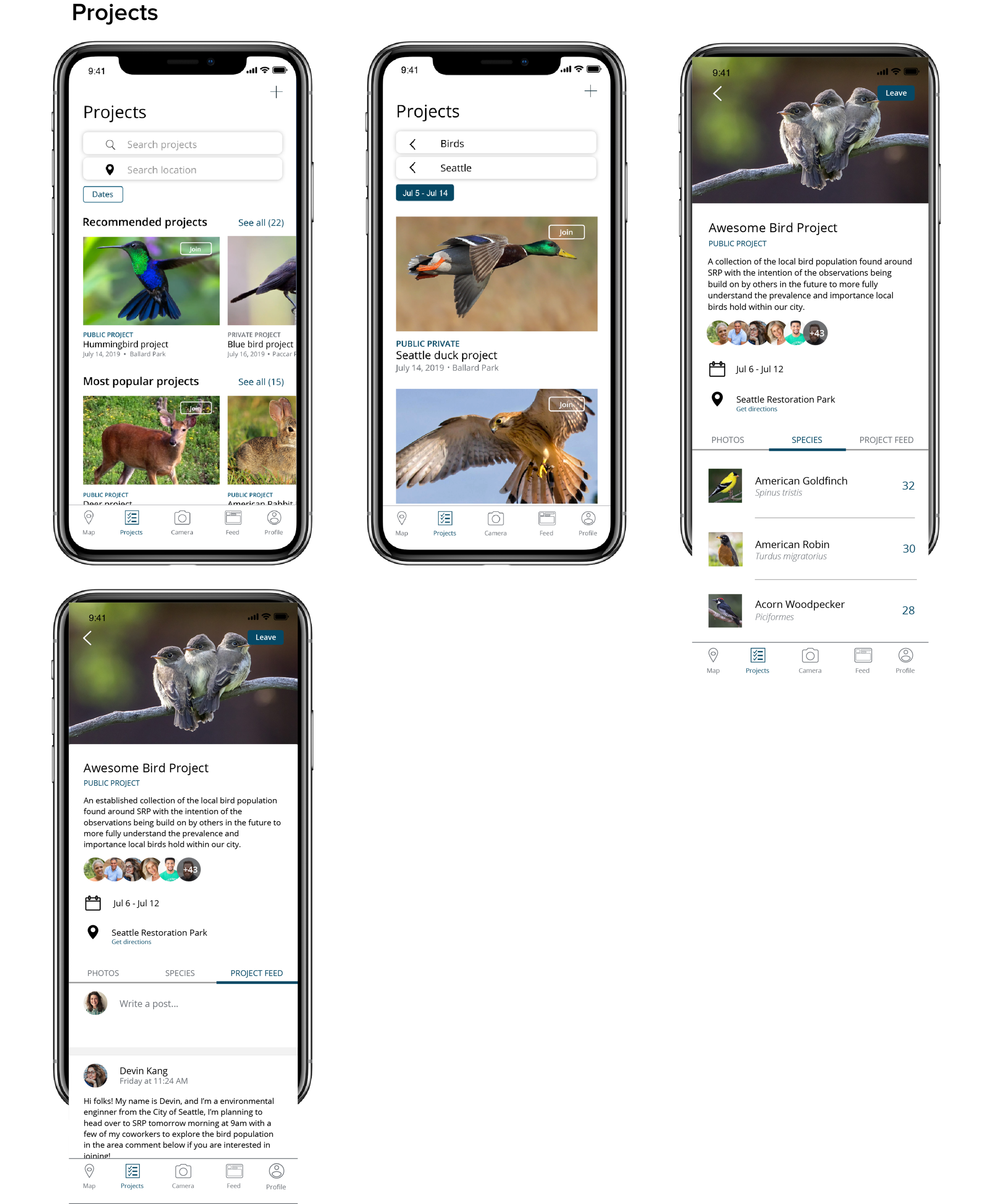
We concluded that we needed five main features for the app: ‘Observations/Map’, ‘Project’, ‘Camera’, ‘Feed’, and ‘Profile’. An ‘Observations/Map’ screen allows users to search and discover encounters in a specified location. ‘Project’ lets users pool their observations of encounters with other people and to search for projects they are interested in.
User Flow
Design Objectives
Maintain consistent design standards, especially between online and offline pages for clear navigation
Add visuals to build user trust and reduce cognitive overload
Iterations
First Iteration
To avoid any confusion whether a user is currently searching for an encounter or project, we decided to combine ‘Encounter’ and ‘Project’ under one search tab because the two screens looked very similar.

Second Iteration
We decided to separate the ‘Encounters’ and ‘Projects’ tabs given that when testing our wireframe many users underwent a sliding gesture when switching between the tabs. However, a sliding gesture would not work since the screen is a map view.
To minimize the number of steps needed for users to filter projects and encounters, we decided to make the process a two click process vs. three.

Final Design


Final Thoughts
Being the only designer on the team I was given the sole task of creating design documents, which was challenging yet a great learning experience. With each iteration, I learned how to clearly and concisely provide design documentations to our developers. Each hand off and iteration was much more clear and organized by maintaining constant communication.